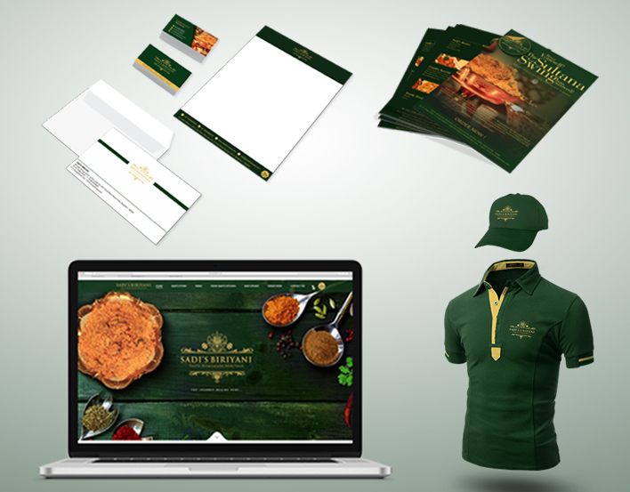
Sadi’s Biryani – Taste Homemade Heritage
Overview
Sadi’s Biryani was looking to make an impact in town. As a new entrant, they were looking to penetrate a highly saturated market with tough competition from all corners. Biryani being an all-time, all-weather fan favourite, there were enough and more players ranging from ‘budget’ and ‘economy’ to the ‘gourmet’ and ‘premium’ segments. Positioning, strategy and communication would be the key to success with such a product.
The Circuit 9 Idea
Sadi’s Biryani wanted to differentiate itself as something authentic and true to its roots, unlike most biryanis that tend to borrow heavily from local influences. To showcase authenticity, we designed a regal logo with a colour code strongly associate with Mughlai cuisine and culture. Our design aesthetics were then translated across both offline and digital platforms, from packaging boxes to social media pages. We made it a point to appeal to the widest possible audience range.
The Outcome
Sadi’s Biryani launched with a big bang, creating maximum noise and maximum impact. Over the next few weeks, Sadi’s Biryani managed to eat into the customer base of its competitors. Patrons lauded the brand for its promise of authenticity as well as its convenient, new age packaging which minimized waste and went a long way in addressing one of our major modern-day challenges, i.e., waste management.
BACK TO CASE STUDIESVisit Website