SAAGAM – HUNGER HUB
Overview
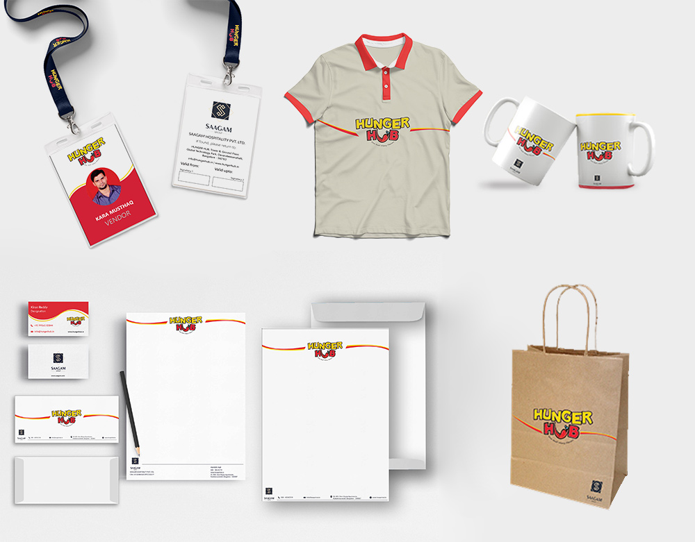
The Saagam Group was looking for an image makeover in terms of logo design. They wanted a new logo that would showcase stability and a solid legacy. They also wanted us to build a complete go-to-market brand identity for their latest venture, Hunger Hub, a multi-cuisine food court in an upscale tech park.
The Circuit 9 Idea
Our creative team came up with a crisp new look for the Saagam Group – one that stood out from the crowd. We also designed the go-to- market brand identity for Hunger Hub and came up with a catchy tagline. Our team used a range of colours that are associated with the sensation of hunger, making Hunger Hub irresistible to a hardworking workforce that always needs to recharge their batteries by chomping down on some goodies.
The Outcome
The new logo gave the Saagam Group the makeover they desired. Perceptions were altered and the industry stalwart was seen in a new light. Hunger Hub was an immediate success as it drew in massive crowds from day one, and footfalls have only picked up since.
BACK TO CASE STUDIES