RG Patil
Overview
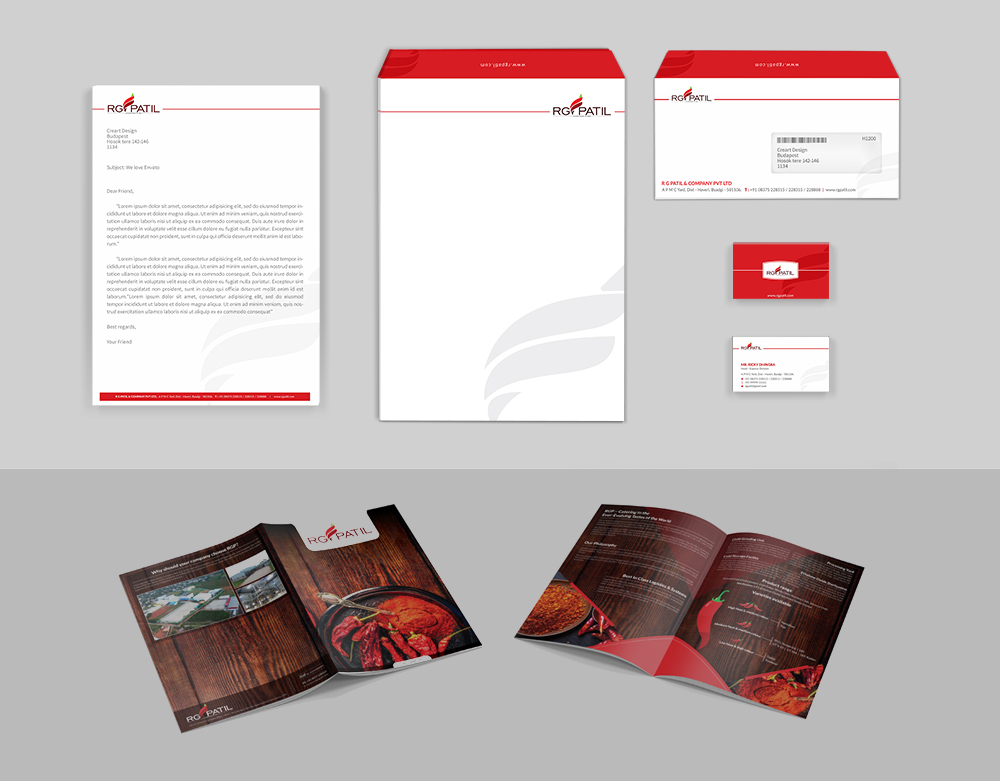
One of the market-leaders in the procuring and manufacturing of red chillis, RG Patil was looking to revamp its complete corporate brand identity. They wanted a crisp, fresh look to take to the market – in order to reaffirm its presence with the existing customer base as well as reach out to a new generation of consumers.
The Circuit 9 Idea
We used their existing colour palette, comprising predominantly of the iconic red and added our own panache to it, crafting a new logo that would be synonymous with a business that’s always growing and evolving. We gave the brand a completely new look-and-feel I terms of business-critical points of corporate communication by designing a new brochure, stationery and other paraphernalia.
The Outcome
Our rebranding exercises were well-received by the client. Working closely together with the marketing team at RG Patil, we were able to create a fresh, exciting look for the industry stalwart. Our creative capabilities turned quite a few heads, and collectively, we managed to build intrigue among the target audience with the new look.
BACK TO CASE STUDIES